
Okay, you DIY website builders. You've done a great job by plunging into launching a website on your own. You've spent hours on online tutorials trying to figure out how to change fonts and images around. You've uploaded portfolio pieces, rewritten copy, and maybe even integrated a social media feed or two.
But there are a few things you might have overlooked in the process of building it that signal to customers that it's a "homemade" website. If you want to give off the impression that you mean business, you'll want to be sure to address a few of the common mistakes rookie website builders make. Here are a few improvements that will put the professional spit and polish on your site right away.
1. Fix your favicon

This is the little tiny icon at the top of the tab of your browser window. Ideally you'd put a tiny, simplified version of your logo or an icon there, instead of the icon that comes with a Squarespace or Wix template.
Is this a huge deal? No. But it is a detail that instantly signals that your website was a DIY job. Changing it to match your branding or logo is just a tiny ways you show clients that you pay attention to detail.
There are lots of tutorials on how to design a favicon in Canva, or upload one to SquareSpace or Wix (I won't cover that in this post), that help you do it yourself. Or ask your designer for the file. It will display at 16x16 pixels (super small), so the design should just be as basic as it comes. Even just one of your brand colors will be an improvement over the generic favicon that came with your template.
2. Fix Your Logo
Unless your website background is white, a white box around your logo is a dead giveaway that you didn't have an expert build your website. Or maybe it's pixelated or stretched which makes it look blurry. This is often just because you loaded the wrong file type (giving you the white box) or file size (making it pixelated or stretched).
You'll want to replace it with a vector or PNG file instead. That way anything that is not the actual logo design will be transparent, allowing the background image or color to show through.

You'll want to ask your designer for a PNG file in the size you want for your website (you'll typically find guidelines about ideal sizes in your template). Otherwise, you can make the changes you need in Adobe Illustrator if you're familiar with that program.
The other option is to use a white header across the site so it blends in perfectly with the rest of the header. Don't worry, you'll be in good company and can incorporate branding and great imagery just below:

3. Fix Your Font
A classic DIY mistake is using "cool" fonts in the wrong places on your website. Let's just start by saying that if someone has a hard time reading the content on your website, they probably won't stick around long. It's just not worth it.
So be sure to make it easy for them by using fairly standard fonts for the body of your content. Anywhere you have more than a sentence should be in a font that is clean and easy to read. This is NOT the place to use fonts that highlight your brand personality...so, no scripts, grunge effects, tight spacing, or compressed letters.

If you choose to use more decorative fonts, only use them in titles or headings. They might create interest and have impact when it's just a word or two, but are distracting and hard to read elsewhere.
Other tips for making a large body of copy easier to read:
- Don't use white fonts on black backgrounds
- Don't use ALL CAPS or bold fonts
- Break content up with images and white space
4. Fix Your Message.
Sometimes small business owners get into a FOMO mentality on their websites, and want to show that they do LOTS of things. You've seen it before, right?
"I'm a yoga teacher who also sells essential oils, and does energy work, but sometimes I teach weight-loss courses too."
And the thing is, you may do all of those things and you can offer all of those things, but initially you need to have a clear message about the primary way you work with people. You need to think about it from your potential customer's point of view: what is the problem they're trying to solve? Speak to the results they'll get from working with you (how they'll feel, what will change).

For instance, the example message above might instead read:
"I'm a yoga teacher who helps people to feel better in their own skin so they live a life with more energy and confidence."
See the difference? You might utilize a variety of tools and techniques in working with your clients (yoga, essential oils, weigh-loss programs), but the RESULT that they want should be the focus. Focus on the what, not the how.
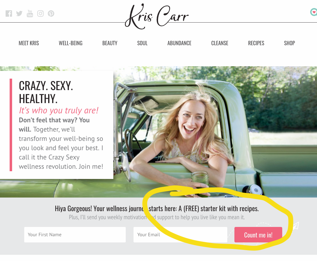
5. Fix Your Opt-In
Once someone is on your website, be sure you give them some sort of incentive so you can keep the conversation going. "Sign up for my newsletter" isn't enough most of the time. You need to give them a little something of value so that they're eager to give your their email and get on your list.
They might not ever visit your website again, but if you can capture their attention RIGHT NOW with a compelling offer, you get the opportunity to continue to provide value to them down the line...which may eventually result in a conversion.
Can you give them something valuable-- a bit of information, a discount, a checklist--that is related to what you do that they'll be glad to have? Make sure that whatever it is, it's front and center on your website (and in a couple of other places too).
Alright, time to dive in! Let me know if you have questions in the comments below--I'm glad to help out or clarify!